Images
Our range of images show different aspects of the offer and its global reach. Our clients are given the same attention as our employees to show their importance to the spirit of our company. We want to be personal, human and sociable, as well as reliable, assertive and confident. We show a holistic view of our activities, using the power of images to articulate our purpose and spirit in a unified and distinct way. In addition, our goal should be to reinforce our visionary approach to building with dynamic and engaging visuals.
Downloads files
Image types
Our image concept will focus on using three specific types of images.
Each of these types of images will, to varying degrees, reflect aspects of the offering, processes, and values.
Taking into account our zoom level and the distance we are from the subject of the image, we can speak in different tones of voice.
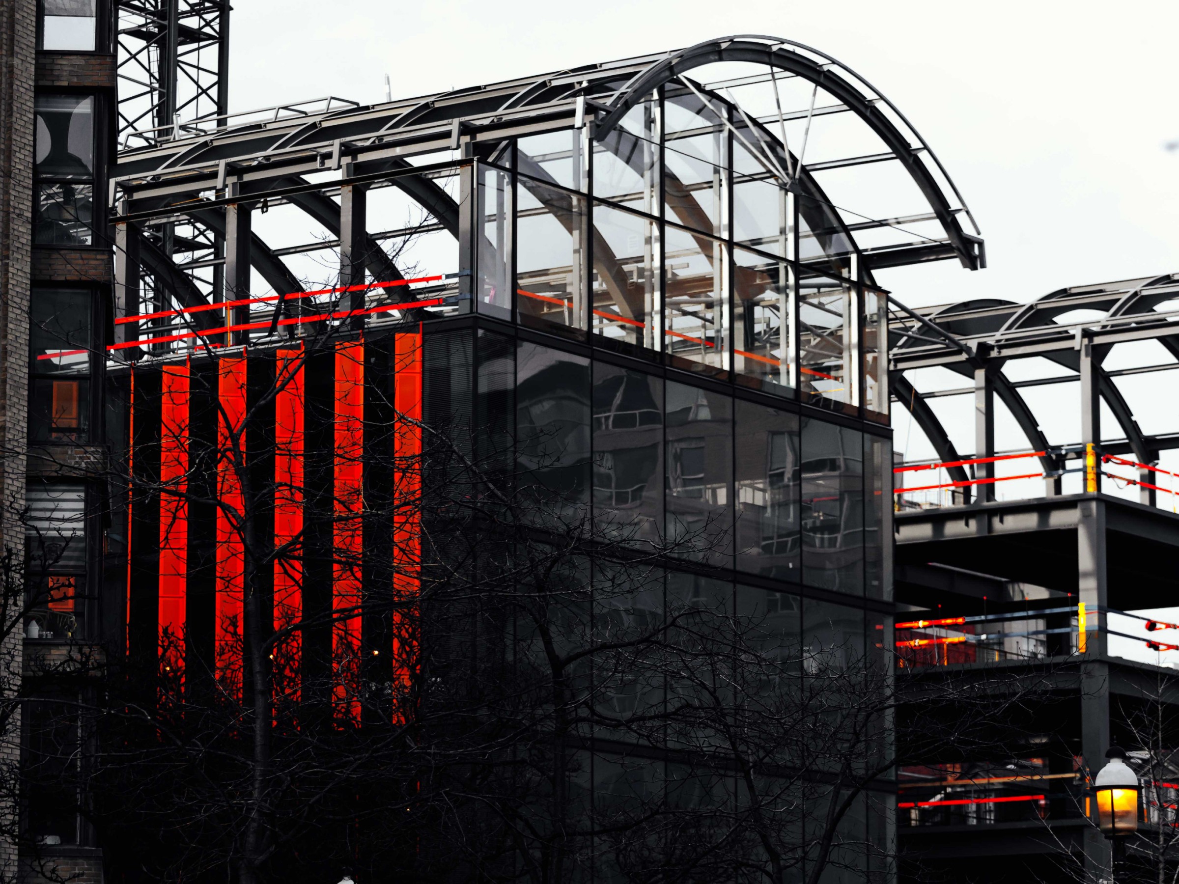
1. Wide
A selection of larger images to help contextualize the scope of the construction.

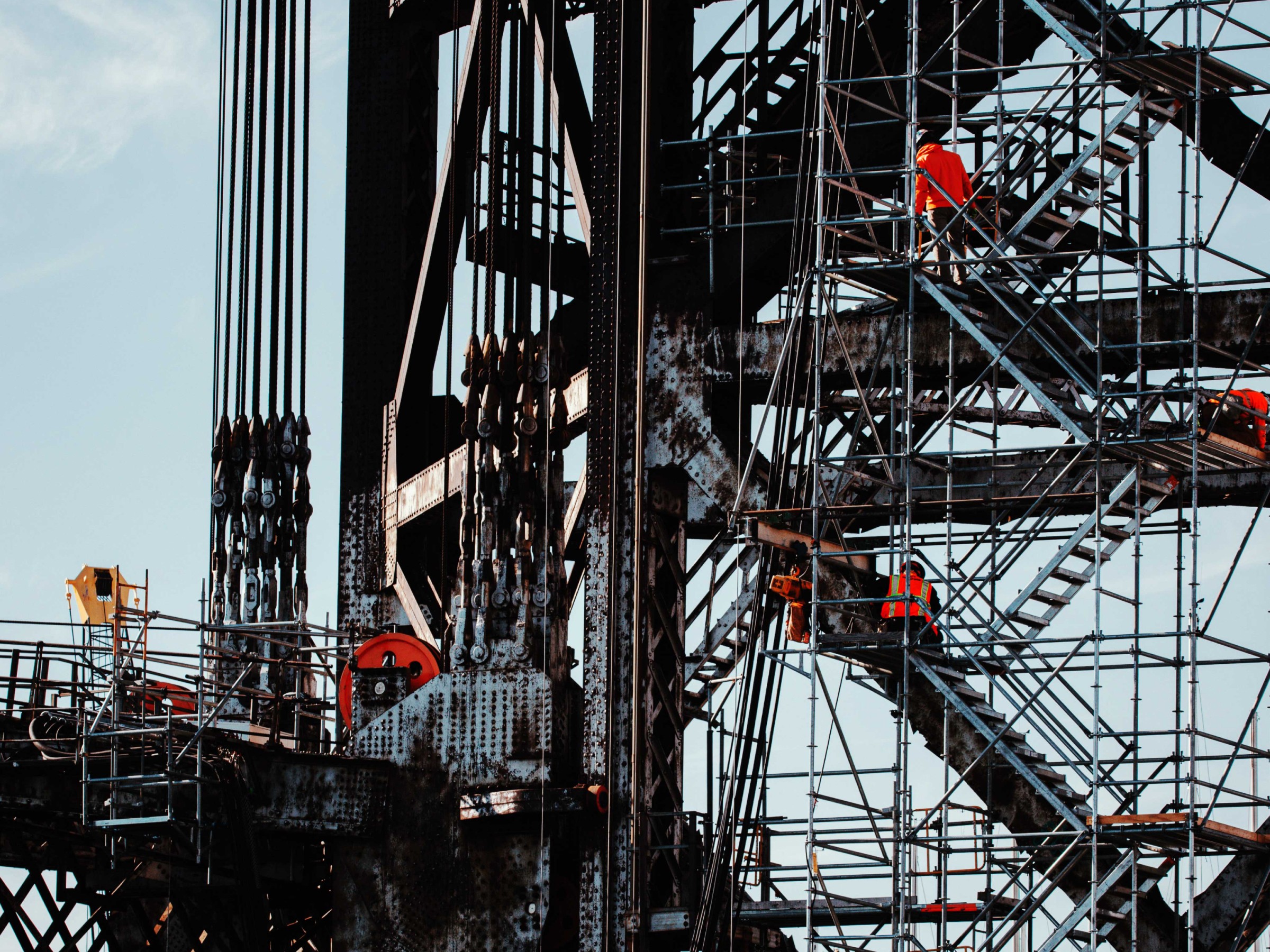
2. Personal
This zoom level aims to convey a sense of accessibility and humanity to the image bank. This is an effective tool to communicate that we are a people-centric company; our customers, our employees and the relationships between them.

3. Detail
Close-up shots showing our curiosity and attention to detail. They provide a supporting detail for our communication. While they are rarely used as character images or headlines, having a number of detailed images helps us communicate more effectively and tell our story in a more engaging way.

Rules
Images are an important tool for conveying the human side of a Brand. Thus, we recommend using them correctly, but make sure they are suitable for the task at hand.
Use borderless images.
Avoid using any objects to mask the image (no circles, no ovals). Use square or rectangular bounding boxes to define the image.
Be singular. Do not place an image on top of another image. Make sure your images are given the space and attention they deserve.
Be smart with any typography overlay. Don't block out important areas of the image, and don't place text on top of occupied areas, making it unreadable.
Treatment
Colors and tone
Due to the wide variety of items depicted in our image library, to ensure a sense of integrity, we ensure that the color and tone of our images are consistent.
Soft and muted tones, and our color palette served as inspiration for the tint of the photographs.
Desaturated and calm color with bright accents that create intrigue.
natural light. No flash.
Not staged or fabricated, demonstrating honest activity and interaction.

Examples